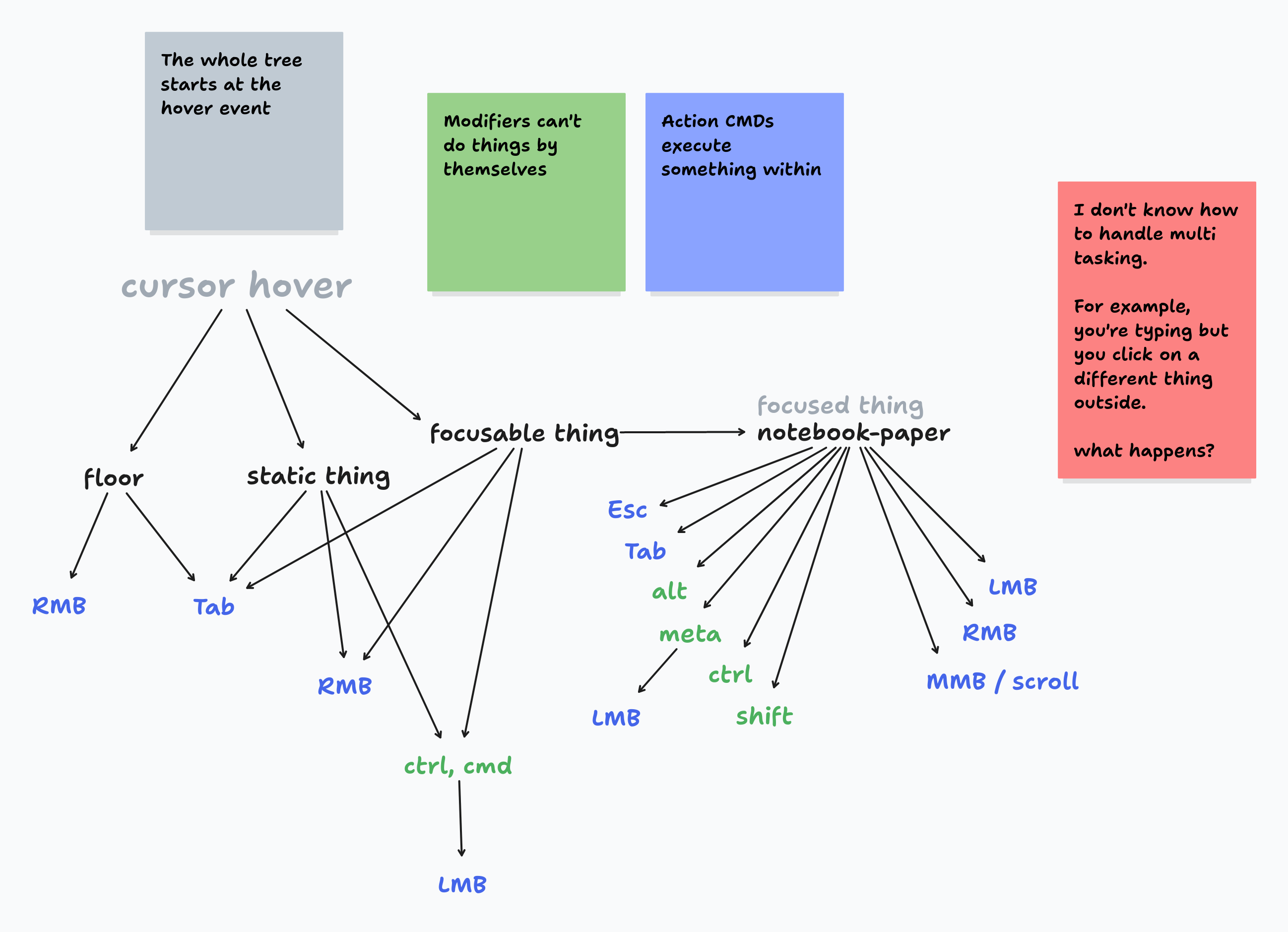
This week I finally focused on the command/action system. I don't know how to call it yet. But I do have defined the way that it works. You can look at the diagram below.

The idea is that all interactions can be understood as a tree starting from the cursor's location.
Here is a text representation of the diagram:
- Cursor hovers on top of elements
- Determine which type of element is being hovered: floor, static thing or controllable thing.
- Actions can be configured at this point of the tree, but they can go further down depending on the modifier keys such as
shiftorctrl.

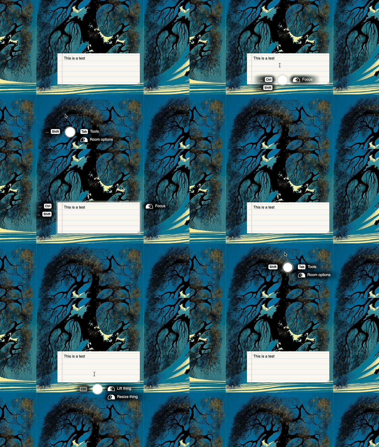
This above GIF is actually incorrect because it doesn't show the available actions once the controllable thing is in focus. But it illustrates how the tree is used to show the available interactions and modifiers using the floating cursor guide.
Modifier-Action Trees
My goal is to make it easy for thing creators to define action trees. This is what I'm kinda aiming for:
const global_actions = {
	// Controllable things
	// Like the notebook-paper, most interactable things in the room.
	"controllable": {

		// When a thing is focused the tree narrows down from here.
		"notebook-paper": {
			// Contents are pulled from the notebook-paper module but shown here for illustration.
			"LMB": {
				text: "",
			}
		},

		// Modifiers available when hovering ANY controllable thing.
		"mods": {
			"Ctrl": {
				// Actions for ANY controllable thing for the "ctrl" modifier
				"LMB": {
					text: "Lift thing"
				},
				"RMB": {
					text: "Resize thing"
				}
			},
			"Shift": {
				"LMB": {
					text: "Multi-select"
				},
				"RMB": {
					text: "Native menu"
				}
			},
		},

		// Actions available just by hovering on ANY controllable thing
		"actions": {
			"LMB": {
				text: "Focus"
			},
		},
	},
	// Static things:
	// Things that are decorative or have no defined interactions.
	"static": {
		// Same structure as for controllable things. Except that there is no further drilling into specific things because that would make it a controllable thing.
	},

	// Floor or room actions
	// Actions like lasso tool to select many things or pulling out a context menu about the wallpaper.
	"floor":
		"mods": {
			"Shift": {
				"LMB": {
					text: "Lasso select"
				},
				"RMB": {
					text: "Native menu"
				}
			}
		},
		"actions": {
			"Tab": {
				text: "Tools"
			},
			"RMB": {
				text: "Options menu"
			}
		}
	}
};
With a setup like this, based on the currently pressed keys and mouse hovering state, and focus state, we can narrow down the options to the available actions.
Action Management
The way I see it is there will be actions defined "globally" like the actions for all controllable or static things and actions for the room floor.
But when a thing has keyboard or mouse interactions it can define those interactions by creating an object tree like that.
Action implementation reference
At the end, when the user runs an action, which will be determined by the action manager module, it will notify the thing module so that it is the thing module that is in charge of running whatever thing is needed. This way the scope is limited to that thing module.
For global actions it would be the same as thing modules but without the thing definition. For example, a pen that allows you to draw anywhere on the floor or at a transparent layer on top of things.
I still need to see how the implementation looks like at the end, but I think that these are good steps towards my goals.
Handling Expected Browser & OS Interactions
Once I finished implementing my goals above mentioned, I came across a problem I had forgotten about. The problem of handling native click interactions like cmd+clicking which clearly interferes with the cmd+drag interaction for things. I previously fixed this problem with "cursors", you need a hand cursor to drag and a pointer cursor to interact naturally.
I like the idea of cursors since it has clear interaction boundaries.
So my options are:
- Keep the cursor system and use the cursor charm to show current cursor tool.
- Keep the global CMD+Drag but handle all weird edge cases for links, etc.
A part of me wants to change the way things work and just handle all edge cases.
Because my issue with having a hand cursor is that it's too simple. You drag things and that's it.
...
I ended up liking the idea of tools and having a tool branch. It provides a domain for handling change history and preventing confusing different intents in the same place. I haven't implemented that yet but the UI and module API is pointing that way:

Toolbelt UI and API
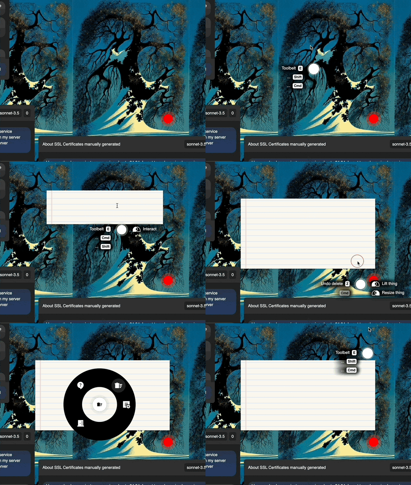
As seen from the GIF above, I've implemented a toolbelt interface that takes inspiration from video game radial menus or item wheels. Moving forward I want to add a settings thing for the toolbelt using bags and other ideas from video games I've already explored on previous room versions.
The API tries to be as simple as possible following the similar pattern that oceloti and other oceloti standard modules follow. For example, using a cursor.register_tool({...}) function.
If you pay close attention you'll notice how the undo command is visible on the left-hand actions. Ideally, once the tool action branch is implemented the undo action will be scoped to the hand tool.
Another thing to notice is that the toolbelt is not locked to just placing things on the room, it can also be used to call scripts or custom actions which makes it a powerful prototyping tool.
Finishing thoughts
It's interesting how code or development patterns are emerging from a few simple decisions at the core of oceloti web rooms. Like the way module interoperability is looking like.
It's also clear now that modules can be used for multiple purposes from being a utility library to providing a full ai assistant chat. But because of the way that oceloti and other standard modules are implemented it sets the example of having modules always be small and simple. The APIs that connect modules between each other are kept simple.
It also seems to follow a flow of modules -> tools -> things. In the sense of abstraction of concerns. Tools and things are defined in modules but it feels like they build on top of each other but is not strictly limited to be that way.
This makes me think what would other developers think of this approach, will they find it easy, strange, ugly? I'll have to tell my friends to try this soon. In any case, it's clear that web rooms now are designed for myself then my gamer/dev friends, then other devs, then other gamer people, then, everyone else. Or something like that.
I'll wrap up this log here since it's already quite messy. Next devlog I'll try to have a timeline so that at least there is a way to map ideas like a thread.